It was late summer in 2010 and Łukasz Dziedzic, already one of the most renowned typeface designers, was about to finish a commission for a huge banking corporation. What he had been working on for the previous six months was a type family which would later be named Lato; very clean and elegant, not too distracting, with a touch of warmth, and reminiscent of summer (which it is named after – ‘lato’ is the Polish word for summer).
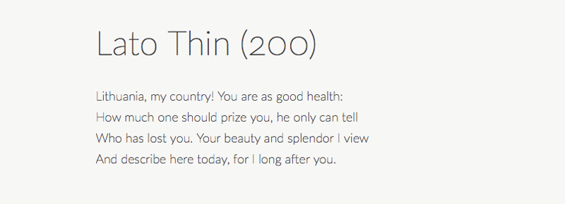 Openning verses of 'Pan Tadeusz' - the epic poem by Adam Mickiewicz. Font: Lato Thin (200) / www.latofonts.com
Shortly before the publication date of the bank’s new graphic identification, including Dziedzic’s font, the corporation’s directors changed their minds and decided they were no longer interested in purchasing the type family he had designed. The reason was quite common, according to Dziedzic’s account:
The story is as simple as that: a bank asked me to draw letters exclusively for them, so I did it. When it came to paying for it, they said it was too expensive and I was left with a type family that I didn’t know what to do with. So I made it available on the Internet.
Thanks to an agreement with Google, the type family was made not only publicly available but also for a very appealing price: for free. It was published with the Open Font License (OFL), meaning that not only can every user download it and use it for their own purposes (even commercial) for free, but it was also made available for bundling, modifying and redistribution.
 Excerpt from Pan Tadeusz's Book Four: Diplomacy and the Hunt. Font: Lato Regular (400) / www.latofonts.com
Lato became a hit in no time. Not only was it massively downloaded but soon other typeface designers started complementing it with additional signs and alphabets. What was a type family of 400 symbols in 10 styles has grown to over 4,000 symbols in 18 styles – a total growth from around 4,000 signs to 50,000! Lato is now available in all Latin alphabets, Cyrillic, and Greek.
Its popularity has maintained itself since the day of its publication. As of the day of writing this article, it’s placed 6th in Google’s trending fonts ranking and is featured on more than 6,867,902 websites. As it so happens, Lato's popularity even tends to surprise its designer.
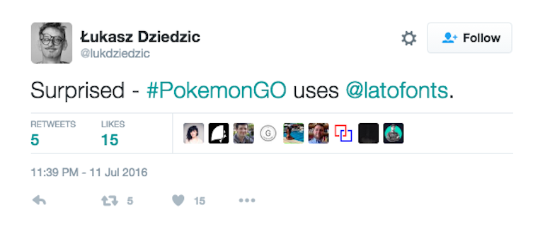 Screenshot from Łukasz Dziedzic's Twitter profile
For Dziedzic, it was a huge turnaround from a total failure to his greatest success, and even if his name was already well-known among specialists, in Poland he gained a celebrity-like status and is very often associated with the post-communist rebirth of high-class typography.
 Excerpt from Pan Tadeusz's Book Twelve: Love and Friendship! Font: Lato Heavy Italic / www.latofonts.com
What is the secret behind Lato’s popularity? Experts are not unanimous. Some believe that it’s the character of the font itself. The font’s description states that:
(…) its designer’s idea was to create a typeface that would seem quite ‘transparent’ when used in body text but would display some original traits when used in larger sizes. He used classical proportions (particularly visible in the uppercase) to give the letterforms familiar harmony and elegance. At the same time, he created a sleek sans serif look, which makes evident the fact that Lato was designed in 2010 – even though it does not follow any current trend.
Apparently, the result of his efforts is more than satisfactory. The font has been praised for its simplicity and even though visual fashion changes rapidly, it still fits in the latest designs.
 Several signs from the lato font family / www.latofonts.com
Others point out the fact that it is rare for a font that stems from a very specific client’s commercial commission to become available on OFL. Meanwhile, such fonts are usually well tempered thanks to being a compromise between what the client needs and what type the designer wants to create.
The process isn't over – the Lato font family is still being updated. You can update the latest version from http://www.latofonts.com/. For free, obviously!
Not surprisingly, the Lato font family includes all the existing signs of the Polish alphabet. Did you know it has 32 letters, nine of which are unique?