The independence of this type of publication grants it greater freedom. The authors do not need to simplify their language in order to reach a wider audience, mainly because they address readers who think alike and understand the proposed language. Only 100 copies were printed, and there is no text in the booklet. The only thing that influences one's interpretation of it is the arrangement of photographs and the way they relate to one another. Since zines disregard acknowledged rules, let’s find out how these images can be read, that is, distorted.
The cover photograph by Ernest Protasiewicz shows bent wire fencing – an arrangement of wire which is normally a system of regular patterns has been damaged. The selected works sometimes compose short stories and sometimes they comment on reality, but most often their abstract, captivating form dominates their meaning. Most of the images in the booklet could function independently. This may be related to the space in which they usually appear: blogs, Instagram, or one of the many online magazines. Single images fight there for our attention, shares, and clicks. On the other hand, at least some photographs were originally part of series (Kolbusz, Wińczyk, Bekas). The title Distortion applies not only to what has been captured, but also to potential new meanings which depend on the viewer's familiarity with cultural contexts and belief in images in general.
 Gabriel Orłowski, Fresh From Poland Zine #1: Distortion, courtesy of the authors
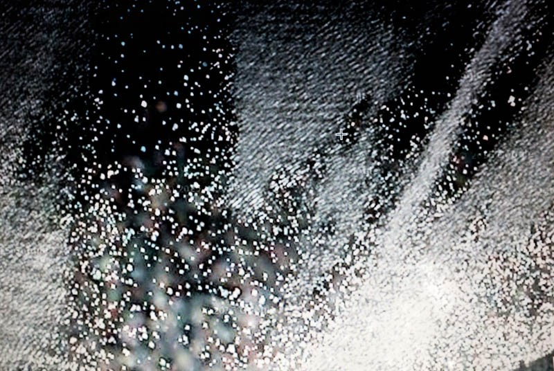
 The booklet opens with a work by Gabriel Orłowski: in the midst of completely white, overexposed pixels we can spot a cross, and it is not clear if we are looking at a screenshot of a video game, or perhaps at an image from an armed drone. In the next photo we see a mountain through which we can discern the translucent images of several people: dead soldiers? missing climbers? Perhaps these are the only two randomly adhered pages in the magazine.
 Karolina Zajączkowska, Fresh From Poland Zine #1: Distortion, courtesy of the authors
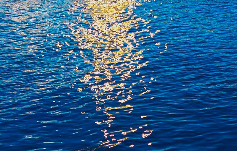
 Following bubbling water in a shade of cyan it gets more familiar for a while: sun rays reflected in water, at times forming a glow-worm milky way, and sometimes a sparkling constellation. After that comes crumpled silver foil which does not need any extra rays of light to shine.
 Piotr Bekas, Fresh From Poland Zine #1: Distortion, courtesy of the authors
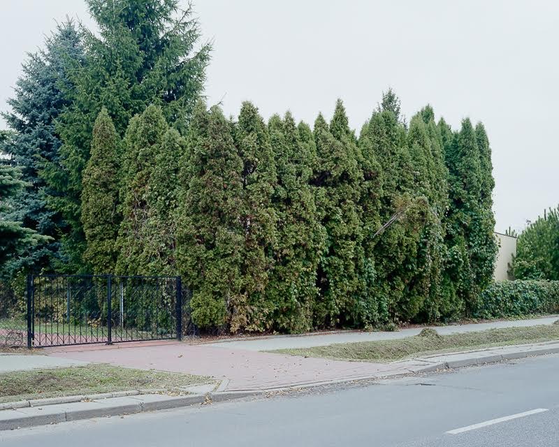
 From enthusiasm for the material the authors of the zine pass into a Polish fawn landscape, signalled by the dark circles on tarmac and a cube-shaped house hidden behind an arborvitae. Piotr Bekas uses photographs of arborvitae to examine the boundaries of the public-private space and seems to wonder whether ‘this row of trees is an extension of curtains’, or a ‘statement by an escapist resident’.
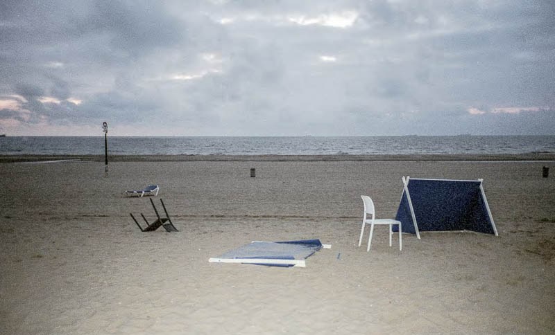
 Ernest Wińczyk, Fresh From Poland Zine #1: Distortion, courtesy of the authors
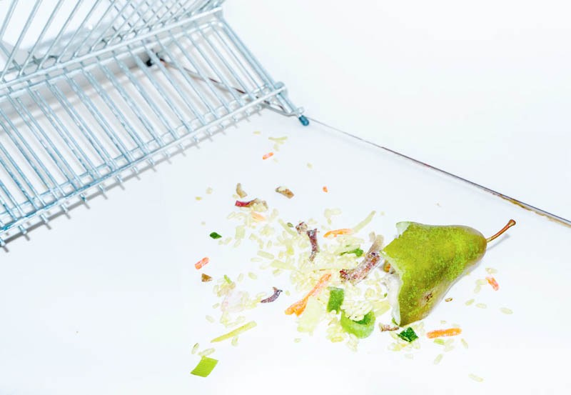
 The photos of subdued greens awakens the ‘explosion’ of a pear – a tongue-in-cheek image by Ernest Wińczyk. Then, the colour palette turns into every shade of blue. However, it is neither azure or cyan, but the colour of the off-season Polish sea, surprisingly similar to the fog of the suburbs, where the central place is occupied by a plastic palm tree. Is this an image of the golden sands, the sunset, and the fulfilled dream of good weather on the Baltic Sea? It’s rather a flashlight and a purple halo reflected on a small family car, or in other words, a Polish standard inciting perhaps a subtle melancholy.
 Martyna Wyrzykowska, Fresh From Poland Zine #1: Distortion, courtesy of the authors
 In the next part of the zine our attention is drawn by heavily saturated images that look like snapshots from films made in Technicolor, or pictures echoing the aesthetics pervading Toilet Paper magazine, although they may seem quite conservative. The tight framing and dense arrangement of the photos next to each other create a mysterious rhythms of folds, deflections and textures. The zine is rounded off by the authors’ names printed on gradient followed by eye ‘moisturising’ chillies immersed in aquamarine.
