 Edgar Bąk, photo: Cezary Hładki
His characteristic style is deceptively simple, based on geometric shapes paired with blow-up typography that breaks with the mundane. Many of his projects come about on the basis of an algorithm that generates a particular pattern, which is then transformed to suit the particular context. Bąk has used this method in designing the visual branding identity for the Sinfonia Varsovia Centre (conceived in collaboration with Robert Mendel) and the graphic layout for the edgy Surowy (Raw) magazine. The result is clean, cohesive design with a modernist-inspired splash of font or colourful graphic.
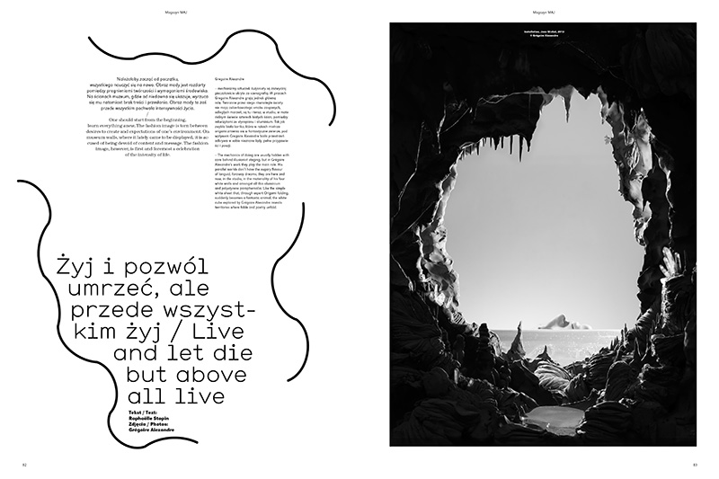 Edgar Bąk, graphic design for MAJ magazine, photo: courtesy of the designer
  Ola Niepsuj. Photo by Małgorzata Turczyńska
This young designer injects a particular playfulness into the visual language of graphic design, with a mature wit and ambiguity that appeals to people of all ages. She concentrates on poster design and illustration, as well as visual identification projects, albums and book covers, combining collage, pencil, ink and paint with digital solutions. She finds her inspiration in the everyday, playing games with word play and retrieving the treasures of folk art. The result is contemporary design with a retro twist.
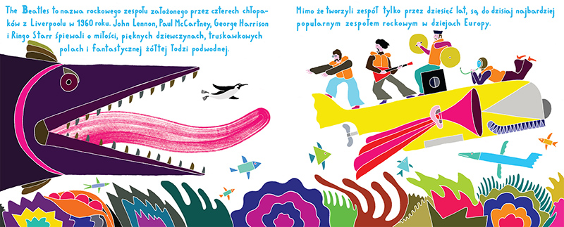
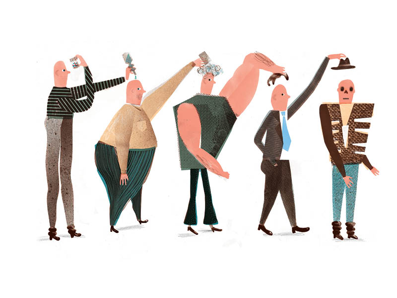 Editorial illustration for Wprost magazine 05/2012, photo: courtesy of the artist
  Tymek Jezierski, photo by: Tomek Dubiel
The illustrator, poster designer and artist is among the most daring of the bunch, injecting a dose of contemporary surrealism into many of his projects, whether it's a concert poster or mural commission. He's been featured in the Lürzer's Archive's selection of 200 Best Illustrators Worldwide and his designs have been published in a wide variety of magazines and books. Yet it doesn't stop there as his keen eye and hand venture into the public space and the gallery to create ironic and unusual pieces that widen the dimensions of traditional graphic design - most recently working in collaboration with his brother, artist Jakub Jezierski.
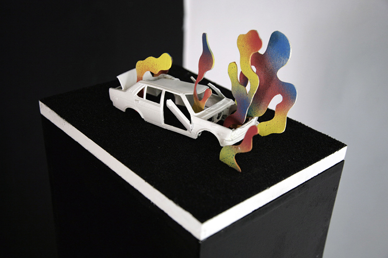 Tymek Jezierski, artwork from the exhibtion When I Close My Eyes
 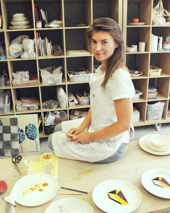 Magalena Łapińska, photo: courtesy of the designer
After honing her skills working on commission as as an illustrator and graphic designer for a few years, she chose a path that would allowher to marry the elements of two-dimensional and three-dimensional design. Her latest project is a collection of whimsical porcelain tableware that her collectors often find too pretty to eat off of - which is why they usually end up hanging on the wall like any other work of art. She uses her intuition to seam together past and present, yet her projects are not mere replicas of the icons of the past, but present a fresh, youthful recouping of these elements and ideas. Her porcelain takes granny-style tableware and gives it a twist, taking the "oldskul" and interpreting it in her very own way, while paying heed to this form's historic legacy.
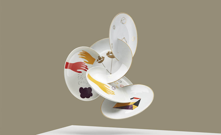 Plates from the Łapińska Porcelana collection photo: Jan Kriwol
  Noviki Studio, courtesy of the artists
The design duo started up by Katarzyna Nesterowicz and Marcin Nowicki takes an experimental approach to design, playing around with new media technologies and expanding its bounds to interactive applications and video-posters, while also making use of various aesthetics - even proposing an 'anti-aesthetic' style. Their approach is quite close to that of the art world, incorporating clashes and idiosyncrasies, while doing in-depth research on each subject before tackling a design project, taking into consideration diverse interpersonal connections.
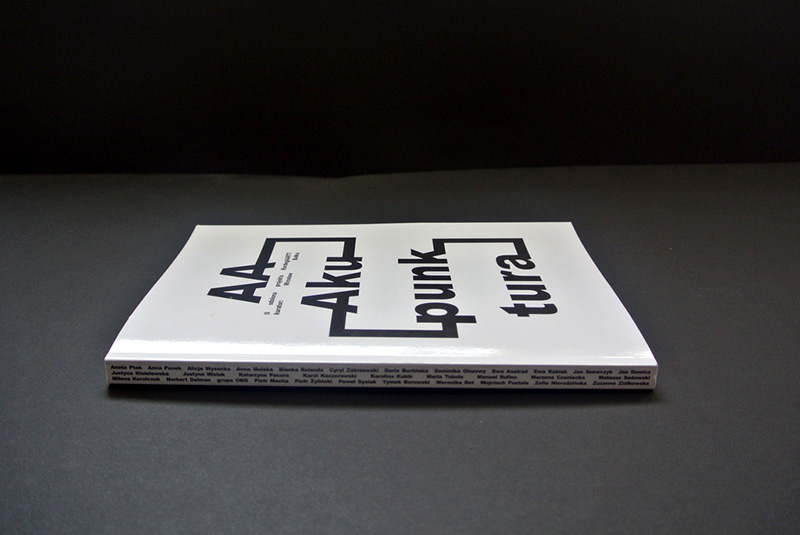 Graphic layout for Mirosław Bałka's Aaakupunktura (book), photo: coutesy of the designers
 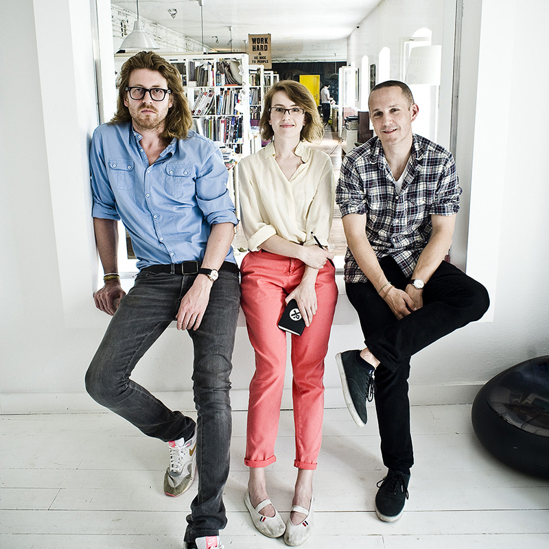 Mamastudio, photo: courtesy of Mamastudio
As one of Poland's premier design studios, it has made its mark on hip Polish design for over a decade with their innovative designs and image campaigns for image-conscious clients. In the process they've won a number of awards and continue to feed of the capital city of Warsaw as they come up with one unconventional project after the next, taking graphic design beyond paper and into the public space. Started up in 2001by three students from the Academy of Fine Art in Warsaw - Michał Pawlik, Magda Ponagajbo and Marcin 'René' Wawrzkiewicz - they have raised their studio from scratch, deftly blending graphic design traditions with new ideas. The trio quite rightly considers its projects 'as if they were (their) own children', hence the name.
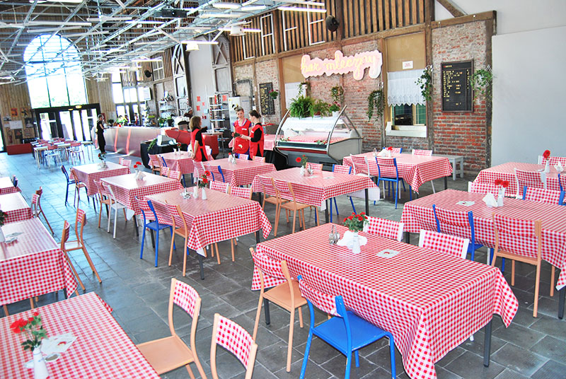 Bar mleczny, gastro installation, photo: courtesy of Mamastudio
  Rene Wawrzkiewicz, photo: courtesy of the artist
As one of the original founders of Mamastudio, he's been on the design scene for nearly a decade-and-a-half. Five years ago he branched off on his own to focus on a wide range of activities - from designer, to researcher to curator. His style is marked by a keen sense for the socially and culturally relevant, creating posters and organising actions that are characteristic for the particular environment they arise in - whether that's Poland, Belarus or Cuba.
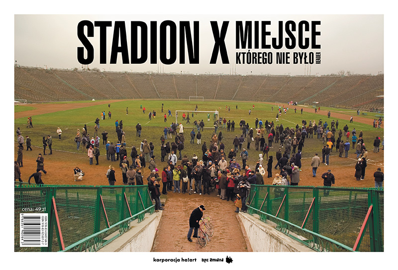 Stadion X, book cover design
  Jan Bajtlk, photo: courtesy of the artist
His style is largely inspired by the graphic design of socialist Poland and its pioneers, with a contemporary turn. He creates his graphic designs by hand, using a minimalist style that captures a particular message within the design - mainly a critical perspective on a social issue or campaigns in the public space. His designs are bright and splashy, popping out at the viewer with its vibrancy and sincerity.
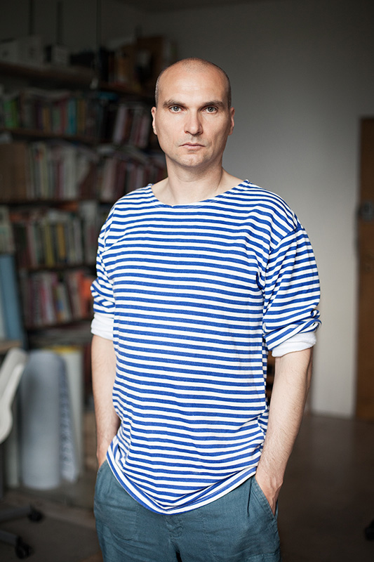 Grzegorz Laszuk, photo: Maciej Landsberg
The designer claims, 'I’m not an artist. I’m a practical designer'. This statement reflects the tongue-in-cheek spirit of Laszuk's approach to the arts. Educated as a lawyer and among the more experienced of our rundown, he says he became fascinated by the technology of design in the 1990s. He discovered how software can give access to the creative sector even for people without a background in the arts. He sees his role as a designer much like that of a shoemaker, balanced between the artisan's instincts and the needs of his clients - both of which are constantly in flux. His poster designs for the TR Warszawa theatre strike at the heart of each particular performance and reflects the meat of its message using a hauntingly sincere composition of words and images.
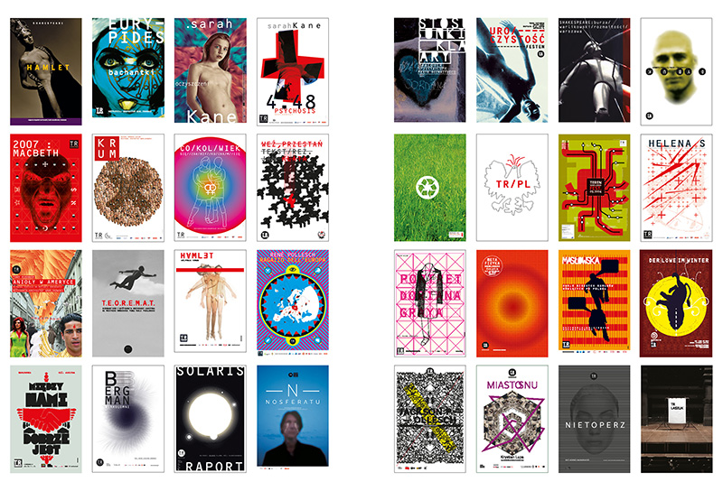 Collected poster designs for TR Warszawa, photo: courtesy of the designer
Editor: Agnes Monod-Gayraud
Source: Culture.pl Resource Library, own sources
Thumbnail credit: editorial illustration by Magdalena Łapińska
25.10.2013